Working with Vertically Pointing Radar Data Using PyART, Xarray, and hvPlot#
This notebook will walk through how to utilize existing packages in the Python ecosystem (PyART, Xarray, and hvPlot) to visualize data from a vertically pointing Ka-band radar.
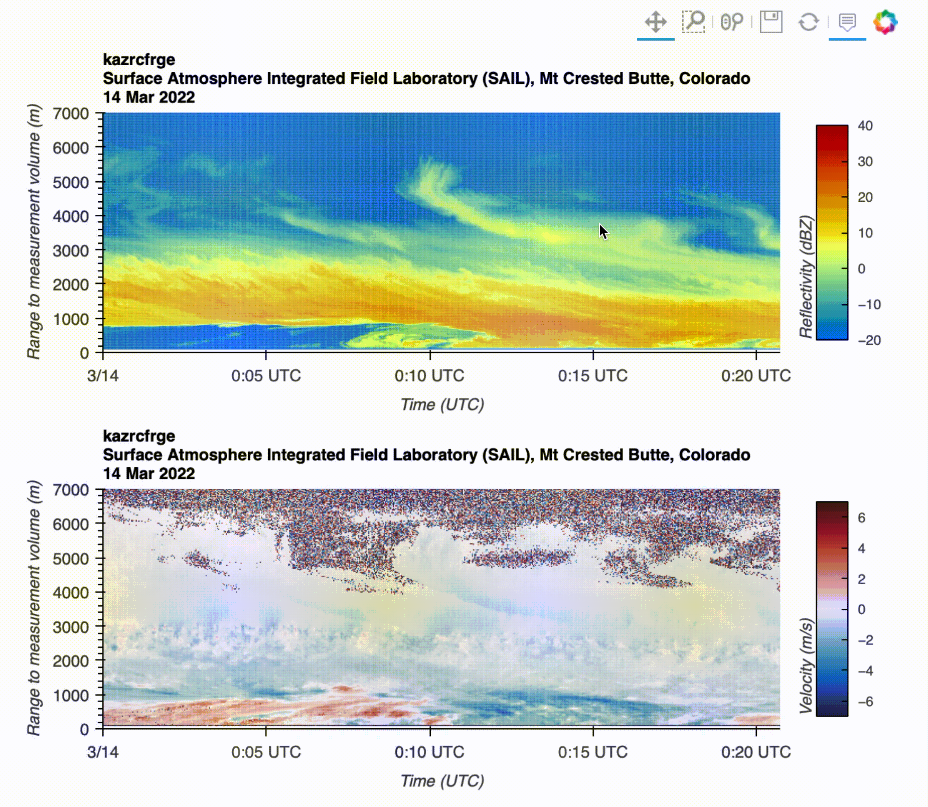
By the end of this notebook, you will learn how to create the following visualization:
Data Overview#
Before starting up this notebook, make sure to download your data from the ARM data portal, using this link!
We are using data from a snow storm on 14 March 2022.
Ka-band ARM zenith radar (KAZR) Instrument#
An image of the KAZR radar collecting the data is shown below:
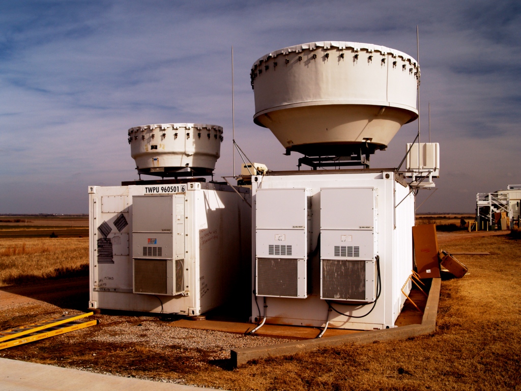
From the official ARM KAZR Documentation, “The Ka-band ARM zenith radar (KAZR) remotely probes the extent and composition of clouds at millimeter wavelengths. The KAZR is a zenith-pointing Doppler radar that operates at a frequency of approximately 35 GHz. The main purpose of this radar is to determine the first three Doppler moments (reflectivity, vertical velocity, and spectral width) at a range resolution of approximately 30 meters from near-ground to nearly 20 km in altitude.”
Imports#
Before running through this notebook, you will need to install :
import matplotlib.pyplot as plt
import glob
import pyart
import pandas as pd
import hvplot.xarray
from bokeh.models.formatters import DatetimeTickFormatter
import xarray as xr
import holoviews as hv
import warnings
warnings.filterwarnings("ignore")
hv.extension("bokeh")


Plot Using PyART#
Let’s first try plotting using the Python ARM Radar Toolkit (PyART)!
Load in the data using pyart#
We can use the pyart.io.read() function for this dataset!
radar = pyart.io.read("guckazrcfrgeM1.a1.20220314.000003.nc")
This returns a radar object, which is the primary data model in PyART
radar
<pyart.core.radar.Radar at 0x7f7dbd517400>
If we wanted to take a look at what fields are available, we can print out radar.fields, formatting that as a list
list(radar.fields)
['linear_depolarization_ratio',
'mean_doppler_velocity',
'mean_doppler_velocity_crosspolar_v',
'reflectivity',
'reflectivity_crosspolar_v',
'signal_to_noise_ratio_copolar_h',
'signal_to_noise_ratio_crosspolar_v',
'spectral_width',
'spectral_width_crosspolar_v']
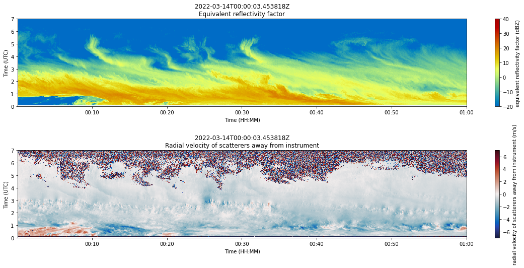
Let’s take a look at reflectivity and mean_doppler_velocity
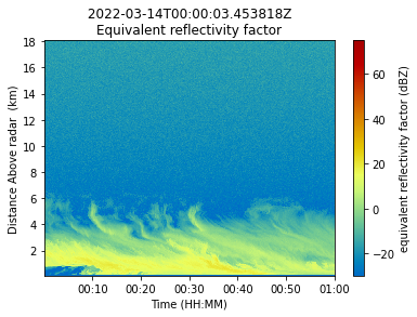
Plot the Data in PyART#
We will use the RadarDisplay as our mapping class, and the plot_vpt, which is made to work with verticall pointing radars (which is what KAZR is!)
display = pyart.graph.RadarDisplay(radar)
display.plot_vpt("reflectivity", time_axis_flag=True, edges=False)
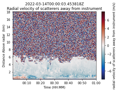
We can also take a look at the mean_doppler_velocity, which is the radial velocity (wind speed) away from the radar (from the ground in this case)
display = pyart.graph.RadarDisplay(radar)
display.plot_vpt(
"mean_doppler_velocity", time_axis_flag=True, edges=False, cmap="pyart_balance"
)
Clean Up the Plots a Bit#
We can zoom in a bit on the lower part of the atmosphere here (below 7 km) since there is a substantial amount of noise above that, and combine our plots into a single figure using plt.subplot()
fig = plt.figure(figsize=(20, 8))
display = pyart.graph.RadarDisplay(radar)
# Create an axis for reflectivity
ax1 = plt.subplot(211)
# Plot reflectivity
display.plot_vpt(
"reflectivity", fig=fig, ax=ax1, vmin=-20, vmax=40, time_axis_flag=True, edges=False
)
# Limit the y-axis to 0 to 7 km
plt.ylim(0, 7)
# Label the y-axis
plt.ylabel("Time (UTC)")
# Create an axis for velocity
ax2 = plt.subplot(212)
# Plot doppler velocity
display.plot_vpt(
"mean_doppler_velocity",
fig=fig,
ax=ax2,
vmin=-7,
vmax=7,
time_axis_flag=True,
edges=False,
cmap="pyart_balance",
)
# Limit the y-axis to 0 to 7 km
plt.ylim(0, 7)
# Label the y-axis
plt.ylabel("Time (UTC)")
# Add some space in between the plots
plt.subplots_adjust(hspace=0.5)
Plot Up Our Analysis Using Xarray + hvPlot#
Let’s try another method of reading in and visualization… focusing on using xarray and hvPlot, which are key components of the Pangeo stack
Read the Data Using Xarray#
Xarray has a similar .open() function, titled open_dataset
ds = xr.open_dataset("guckazrcfrgeM1.a1.20220314.000003.nc")
ds
<xarray.Dataset>
Dimensions: (time: 1736, range: 600, frequency: 1,
sweep: 1, r_calib: 1)
Coordinates:
* time (time) datetime64[ns] 2022-03-14T00:0...
* frequency (frequency) float32 3.489e+10
* range (range) float32 100.7 ... 1.806e+04
azimuth (time) float32 0.0 0.0 0.0 ... 0.0 0.0
elevation (time) float32 90.0 90.0 ... 90.0 90.0
Dimensions without coordinates: sweep, r_calib
Data variables: (12/38)
base_time datetime64[ns] 2022-03-14T00:00:03
time_offset (time) datetime64[ns] 2022-03-14T00:0...
linear_depolarization_ratio (time, range) float32 ...
mean_doppler_velocity (time, range) float32 ...
mean_doppler_velocity_crosspolar_v (time, range) float32 ...
reflectivity (time, range) float32 ...
... ...
longitude float64 -107.0
altitude float64 2.886e+03
altitude_agl float64 3.0
lat float64 38.96
lon float64 -107.0
alt float64 2.886e+03
Attributes: (12/31)
command_line: kazrcfr_ingest -s guc -f M1
Conventions: ARM-1.3 CF/Radial-1.4 instrument_parameters rad...
process_version: ingest-kazrcfr-1.3-0.el7
dod_version: kazrcfrge-a1-1.1
input_source: /data/collection/guc/guckazrM1.00/KAZR_MOMENTS_...
site_id: guc
... ...
scan_mode: vertically-pointing
scan_name: vpt
software_version: 1.7.6 (Wed Mar 23 17:10:35 UTC 2016 leachman
title: ARM KAZR Moments
doi: 10.5439/1498936
history: created by user dsmgr on machine procnode2 at 2...Subset for Time, Reflectivity and Velocity#
Xarray has some helpful subsetting tools - including isel() which is index-based selection. In this case, since we don’t want to visualize the entire time period, we select the first 600 time steps
ds = ds.isel(time=range(600))
We are interested in looking at reflectivity and velocity here, and we can drop a couple of extra coordinates we don’t need (azimuth and elevation) since we won’t use them
ds = ds[["reflectivity", "mean_doppler_velocity"]].drop(["elevation", "azimuth"])
ds
<xarray.Dataset>
Dimensions: (time: 600, range: 600)
Coordinates:
* time (time) datetime64[ns] 2022-03-14T00:00:00.453818 ....
* range (range) float32 100.7 130.7 ... 1.803e+04 1.806e+04
Data variables:
reflectivity (time, range) float32 ...
mean_doppler_velocity (time, range) float32 ...
Attributes: (12/31)
command_line: kazrcfr_ingest -s guc -f M1
Conventions: ARM-1.3 CF/Radial-1.4 instrument_parameters rad...
process_version: ingest-kazrcfr-1.3-0.el7
dod_version: kazrcfrge-a1-1.1
input_source: /data/collection/guc/guckazrM1.00/KAZR_MOMENTS_...
site_id: guc
... ...
scan_mode: vertically-pointing
scan_name: vpt
software_version: 1.7.6 (Wed Mar 23 17:10:35 UTC 2016 leachman
title: ARM KAZR Moments
doi: 10.5439/1498936
history: created by user dsmgr on machine procnode2 at 2...Plot a Quick Plot using Xarray#
We can use the .plot() with our dataset if we want to get a quick-look at the data
ds.reflectivity.plot(x="time", cmap="pyart_HomeyerRainbow", vmin=-20, vmax=40)
<matplotlib.collections.QuadMesh at 0x7f7dad654f10>
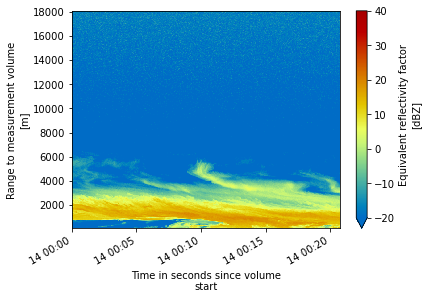
This provided a similar view to our plot above - but what if we wanted to plot this interactively? We can use hvPlot which is a high-level interactive plotting library, meant to work with xarray.Datasets along with other popular components of the Python ecosystem.
Extract Date Information for Labels#
Before we jump into the plotting, let’s define some helpful formatting tools.
First, we can parse the date from our dataset:
date = pd.to_datetime(ds.time.values[0]).strftime("%d %b %Y")
date
'14 Mar 2022'
For the interactive plot, we need to specify how our x-axis (time) labels are formatted
formatter = DatetimeTickFormatter(minutes="%H:%M UTC")
Create our Holoviews Plots#
We create two interactive plots, one for reflectivity and the other doppler velocity.
Included in each plotting call are additional parameters:
x: which field to use as the x-axiscmap: which colormap to useclim: color bar limits (equivalent to vmin/vmax)hover: whether to plot an interactive data inspection toolcolorbar: whether to include a colorbar with the plotclabel: colorbar labeltitle: Plot title (works at the subplot level)xformatter: formatter for the x-axis, in this case, our timexlabel: label
ref_plot = ds.reflectivity.hvplot.quadmesh(
x="time",
cmap="pyart_HomeyerRainbow",
clim=(-20, 40),
ylim=(0, 7000),
hover=True,
colorbar=True,
clabel="Reflectivity (dBZ)",
title=f"{ds.platform_id} \n{ds.location_description} \n{date}",
xformatter=formatter,
xlabel="Time (UTC)",
).opts(
fontsize={
"title": 10,
"labels": 10,
"xticks": 10,
"yticks": 10,
}
)
vel_plot = ds.mean_doppler_velocity.hvplot.quadmesh(
x="time",
cmap="pyart_balance",
clim=(-7, 7),
ylim=(0, 7000),
clabel="Velocity (m/s)",
title=f"{ds.platform_id} \n{ds.location_description} \n{date}",
xformatter=formatter,
xlabel="Time (UTC)",
).opts(fontsize={"title": 10, "labels": 10, "xticks": 10, "yticks": 10})
View the Final Visualization#
Now that we have prepared our plots, let’s take a look at the output!
We can combine our plots by adding them (plot1 + plot2) together, specifying we desire a single column (.cols(1)).
(ref_plot + vel_plot).cols(1)