Note
Go to the end to download the full example code.
Example plot using stripes#
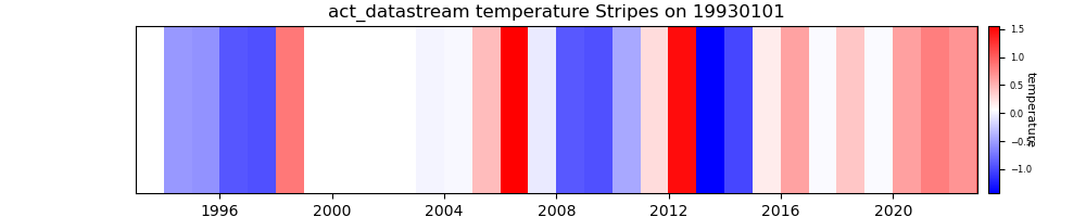
Plot up climate stripes plots from already existing climatologies from ARM data. Author: Adam Theisen
import matplotlib.pyplot as plt

import act

# SGP E13 MET data has already been processed to yearly averages,
# removing data flagged by embedded qc and DQRs
url = 'https://raw.githubusercontent.com/AdamTheisen/ARM-Climatologies/refs/heads/main/results/sgpmetE13.b1_temp_mean_YS.csv'
col_names = [
    'time',
    'temperature',
    'count',
    'minimum',
    'maximum',
    'standard_deviation',
    'standard_error',
]
ds = act.io.read_csv(
    url,
    column_names=col_names,
    index_col=0,
    parse_dates=['time'],
    date_format="%Y-%m-%dT%H:%M:%S",
    header=0,
)

# Drop years with less than 500000 samples
ds = ds.where(ds['count'] > 500000)

# Create plot display
display = act.plotting.TimeSeriesDisplay(ds, figsize=(10, 2))
reference = ['2003-01-01', '2013-01-01']
display.plot_stripes('temperature', reference_period=reference)

plt.show()
Total running time of the script: (0 minutes 0.294 seconds)