Note
Go to the end to download the full example code.
Tracking wildfire smoke with AirNow#
Canadian wildfire smoke routinely degrades air quality across the US
Midwest and Great Lakes. This example uses ACT’s AirNow discovery function
act.discovery.get_airnow_bounded_obs as the single data source to build
a picture of one such event, and plots it entirely with ACT’s own displays
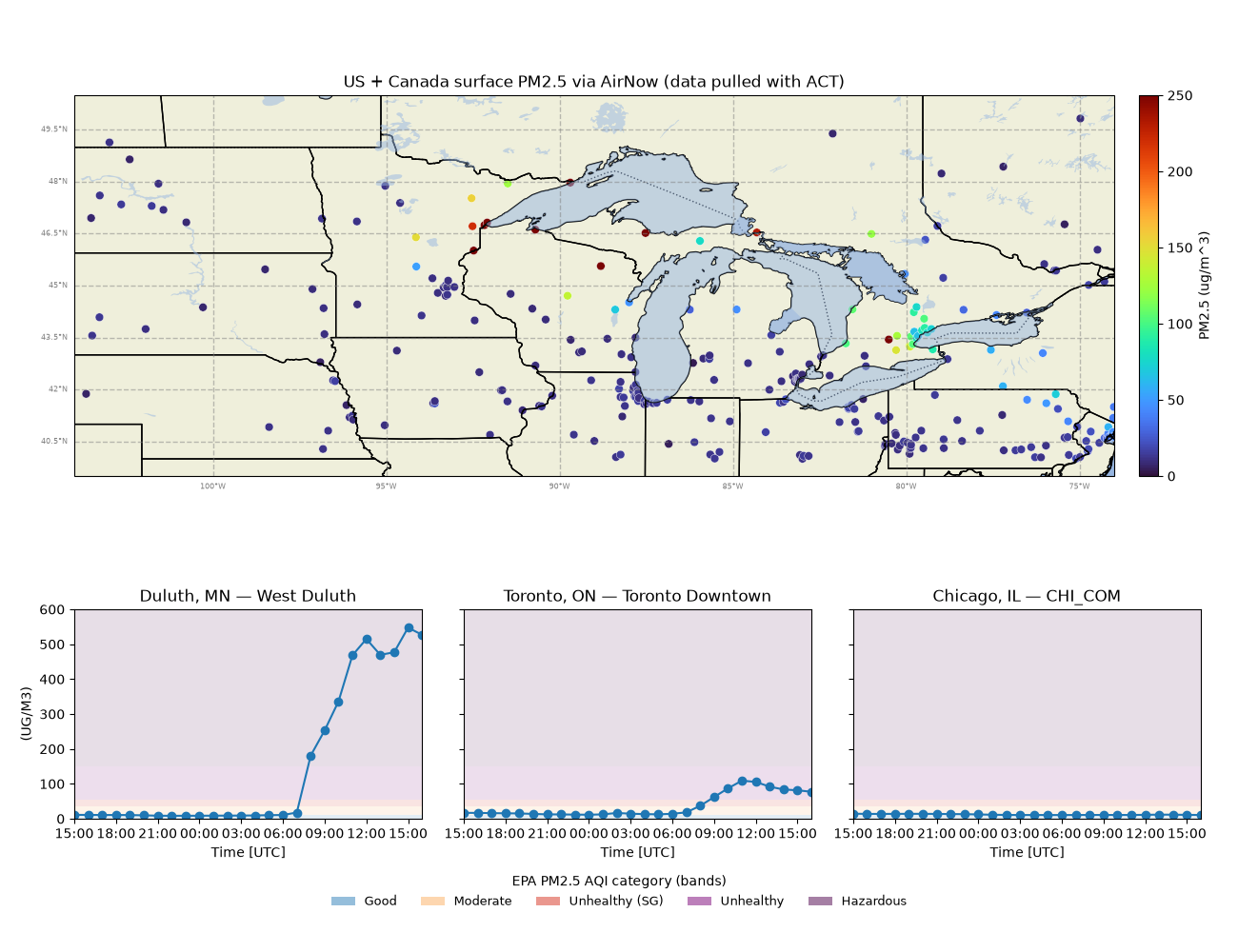
combined into one four-panel figure:
a regional map of the latest hourly surface PM2.5 at every AirNow station (
GeographicPlotDisplay) on top, and24-hour PM2.5 time series for one site each in Duluth MN, Toronto ON, and Chicago IL (
TimeSeriesDisplay) on a shared y-axis below, with EPA AQI category bands shaded behind them.
Because the US EPA AirNow feed also re-serves Canadian provincial monitors (for example the Ontario Ministry of the Environment network), a single API path covers stations on both sides of the border.
The date window below is fixed to a July 2026 smoke episode so the example is
reproducible; AirNow serves this range from its rolling archive. Set your free
AirNow token (https://docs.airnowapi.org/) in the AIRNOW_API environment
variable before running.
Author: Scott Collis Author: Claude (Anthropic)
import os

import cartopy.crs as ccrs
import matplotlib.pyplot as plt
import numpy as np
import xarray as xr
from matplotlib.patches import Patch

import act

# ---------------------------------------------------------------------------
# Fixed date window (UTC). AirNow expects 'YYYY-MM-DDTHH'. Pinning the dates
# (rather than using the current time) keeps the example reproducible.
# ---------------------------------------------------------------------------
START_DATE = '2026-07-14T15'
END_DATE = '2026-07-15T16'

token = os.getenv('AIRNOW_API')

# Map colorbar ceiling (ug/m^3).
PM25_MAX = 250.0

# EPA PM2.5 AQI category bands: (low, high, color, label), ug/m^3.
EPA_BANDS = [
    (0.0, 12.0, '#2c7fb8', 'Good'),
    (12.0, 35.4, '#fdae61', 'Moderate'),
    (35.4, 55.4, '#d7301f', 'Unhealthy (SG)'),
    (55.4, 150.4, '#7a0177', 'Unhealthy'),
    (150.4, 600.0, '#4d004b', 'Hazardous'),
]


if token is not None and len(token) > 0:
    # -----------------------------------------------------------------------
    # 1. Pull every station in the map region through ACT. data_type='B'
    #    returns both AQI and concentrations; mon_type=2 includes permanent
    #    and mobile monitors. The result is a (time, sites) xarray.Dataset.
    # -----------------------------------------------------------------------
    map_bounds = '-104,40,-74,50'

    ds_map = act.discovery.get_airnow_bounded_obs(
        token,
        START_DATE,
        END_DATE,
        map_bounds,
        'PM25',
        mon_type=2,
        data_type='B',
    )

    # Reduce to the latest valid PM2.5 per site. AirNow flags missing as -999.
    pm = ds_map['PM2.5'].values.copy()
    pm[pm < 0] = np.nan

    latest = np.array(
        [col[np.where(~np.isnan(col))[0][-1]] if np.any(~np.isnan(col)) else np.nan for col in pm.T]
    )

    ds_latest = xr.Dataset(
        {'PM2.5': ('sites', latest)},
        coords={
            'latitude': ('sites', ds_map['latitude'].values),
            'longitude': ('sites', ds_map['longitude'].values),
        },
    )

    ds_latest['PM2.5'].attrs = {
        'long_name': 'PM2.5',
        'units': 'ug/m^3',
    }

    # -----------------------------------------------------------------------
    # 2. Pull a tight bounding box around one site in each of three cities.
    # -----------------------------------------------------------------------
    cities = {
        'Duluth, MN': ('-92.3,46.6,-91.9,47.0', 'West Duluth'),
        'Toronto, ON': ('-79.65,43.58,-79.25,43.85', 'Toronto Downtown'),
        'Chicago, IL': ('-87.9,41.7,-87.5,42.05', 'CHI_COM'),
    }

    ds_cities = {}

    for city, (bounds, site) in cities.items():
        ds = act.discovery.get_airnow_bounded_obs(
            token,
            START_DATE,
            END_DATE,
            bounds,
            'PM25',
            mon_type=2,
            data_type='B',
        )

        ds_cities[city] = ds.sel(sites=site)

    # -----------------------------------------------------------------------
    # 3. Create the map using GeographicPlotDisplay.
    #
    #    geoplot() creates the Cartopy GeoAxes required by the map and
    #    returns that axis. Use the returned axis and its figure directly
    #    rather than creating and subsequently closing another figure.
    # -----------------------------------------------------------------------
    geo = act.plotting.GeographicPlotDisplay(ds_latest)

    map_ax = geo.geoplot(
        'PM2.5',
        lat_field='latitude',
        lon_field='longitude',
        projection=ccrs.PlateCarree(),
        cartopy_feature=['LAND', 'OCEAN', 'LAKES', 'STATES', 'BORDERS'],
        title='US + Canada surface PM2.5 via AirNow (data pulled with ACT)',
        cmap='turbo',
        vmin=0,
        vmax=PM25_MAX,
        marker='o',
        s=40,
        edgecolor='white',
        linewidth=0.3,
    )

    # Use the figure created by GeographicPlotDisplay as the common figure.
    fig = map_ax.figure
    fig.set_size_inches(13, 10)

    map_ax.set_extent(
        [-104, -74, 39.5, 50.5],
        crs=ccrs.PlateCarree(),
    )

    # Position the map in the upper portion of the combined figure.
    map_ax.set_position([0.06, 0.48, 0.84, 0.44])

    # GeographicPlotDisplay creates the colorbar on the same figure.
    # Move it alongside the resized map.
    cbar_axes = [ax for ax in fig.axes if ax is not map_ax]

    if cbar_axes:
        cbar_axes[-1].set_position([0.92, 0.50, 0.018, 0.40])

    # -----------------------------------------------------------------------
    # 4. Create the three time-series axes directly on the same figure.
    # -----------------------------------------------------------------------
    gs = fig.add_gridspec(
        1,
        3,
        left=0.06,
        right=0.97,
        bottom=0.14,
        top=0.36,
        wspace=0.12,
    )

    bottom_axes = []

    for idx in range(3):
        if idx == 0:
            ax = fig.add_subplot(gs[0, idx])
        else:
            ax = fig.add_subplot(
                gs[0, idx],
                sharey=bottom_axes[0],
            )

        bottom_axes.append(ax)

    # -----------------------------------------------------------------------
    # 5. Assign an ACT TimeSeriesDisplay to each existing axis.
    #
    #    This avoids creating a TimeSeriesDisplay figure, closing it, and
    #    manually replacing tsd.fig and tsd.axes.
    # -----------------------------------------------------------------------
    for idx, (city, (_, site)) in enumerate(cities.items()):
        ax = bottom_axes[idx]

        # Add the EPA category bands before the data so they remain in
        # the background.
        for lo, hi, color, _ in EPA_BANDS:
            ax.axhspan(
                lo,
                hi,
                color=color,
                alpha=0.13,
                zorder=0,
                linewidth=0,
            )

        tsd = act.plotting.TimeSeriesDisplay(
            ds_cities[city],
            subplot_shape=None,
        )

        tsd.assign_to_figure_axis(fig, ax)

        tsd.plot(
            'PM2.5',
            y_rng=(0, 600),
            force_line_plot=True,
            marker='o',
            set_title=f'{city} — {site}',
        )

        if idx > 0:
            ax.set_ylabel('')
            ax.tick_params(labelleft=False)

    # -----------------------------------------------------------------------
    # 6. Add the EPA category legend.
    # -----------------------------------------------------------------------
    handles = [
        Patch(
            facecolor=color,
            alpha=0.5,
            label=label,
        )
        for _, _, color, label in EPA_BANDS
    ]

    fig.legend(
        handles=handles,
        loc='lower center',
        ncol=5,
        frameon=False,
        fontsize=9,
        bbox_to_anchor=(0.5, 0.035),
        title='EPA PM2.5 AQI category (bands)',
    )

    plt.show()
Total running time of the script: (0 minutes 43.185 seconds)